Seabrook
Branding Brilliance
Creating long term brand consistency and continuity with a toolkit that empowers
The Challenge
Seabrook Crisps, a British brand that’s been making snacks in Yorkshire since 1945, had all the ingredients of a brilliant brand, but needed help creating simplicity and consistency across every touchpoint where the brand is seen, from packaging to advertising.
While the brand had a strong presence, inconsistencies in execution across packaging, digital, and advertising meant a single source of truth, clear principles, and practical toolkit was needed. The objective was to empower creativity, not hold it back.
Our Approach
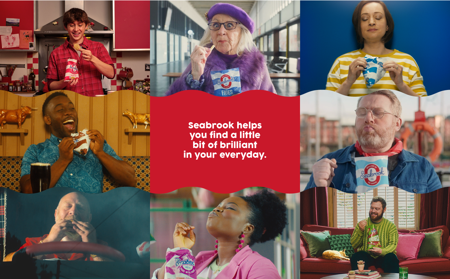
Building on the distinctive look and feel established in advertising on TV and beyond, which used bold colours and symmetry, we developed a set of brand guidelines to ensure consistency at every single point somebody has a chance to see the brand.
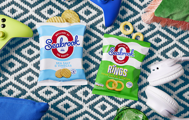
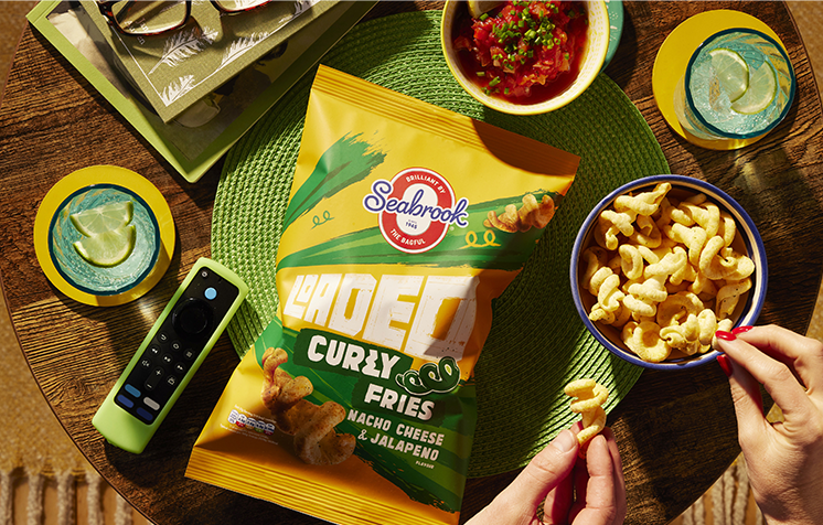
Seabrook is all about finding beauty in everyday, and ethos reflected in everything they do. So on top of the brand guidelines and toolkit, we captured this thought in stills photography, capturing moments and scenarios from consumer research to collate an authentic image library.